Organic Gelato and Coffee Online Shopping Experience Case Study
OBJECTIVE:
This was a group class assignment in the General Assembly UX Design Immersive I took January - March 2014. The goal was to create an online shopping experience for a gelato company. Our team took the challenge head on and created a supreme shopping and browsing experience starting from the user's goals all the way through branding and visual design.
PROCESS:
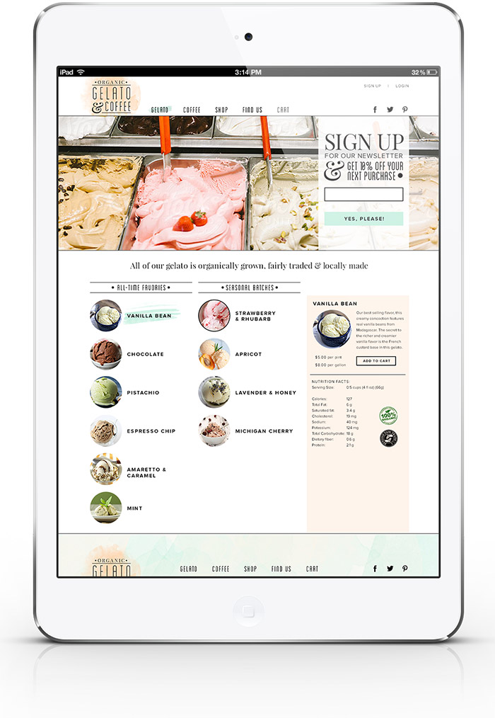
We started by getting a clear idea of the kind of Gelato company we wanted to focus on. Because this wasn't a real brand we had to create one and decide on some of the company's goals. We talked about the kind of consumer this company would want to attract, and from there got specific on 2 main personas. After we understood who our user was, the site map started to take shape. We removed many of the "typical" pages similar site have that we felt created unnecessary barriers for the user. For example, we listed all flavors directly on the homepage. Instead of having product detail pages for each flavor, we provided that in a side bar on the same page. This streamlined our user flows and would enable our customers order their products faster.
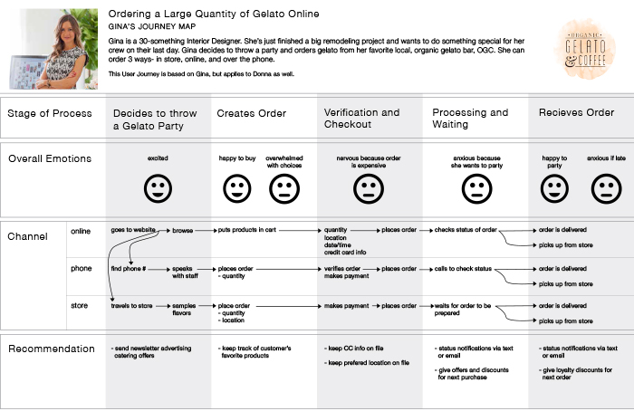
Since our gelato store had 3 ways for users to order our products (online, in store, and over the phone) we wanted to make sure each experience was as fluid as possible. Our journey map was essential to pointing out any pain points and correcting them.
Because we had the luxury of creating whatever we wanted for this project, we also looked into the business goals of our fake gelato company. We created a few different marketing techniques to get customers on the site ordering products. There are 3 ways a user can order gelato on our site: 1) order whatever flavors and quantities they want, 2) send a gelato as a gift to someone else, 3) become a gelato club member and receive gelato every month! All these decisions were continuously backed up by our Personas.
As an added challenge, we created a tablet prototype of our shopping experience as well as a logo and web design. For the video prototype, check out the video linked at the end of this post.
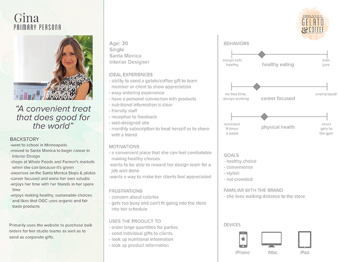
Our primary Persona who inspired all business and design decisions we made.
The simplified site map and user flows.

Journey map of all 3 ordering flows – online, in store, and by phone.
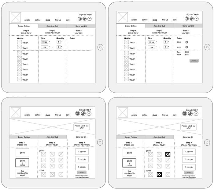
Furious white-boarding sessions made way to cleaned up wireframes that were turned into a clickable prototype video.

The last piece of the UX process for us was the branding and web design of the home page.