Contact Wrangler Mobile UX Case Study
OBJECTIVE:
This is a personal project I’m currently working on. Contact Wrangler is for anyone who wants a little more organization in their lives. The default contact app in our smart phones only does half the job. Contact Wrangler would allow users to make and manage their own groups, send mass texts and emails with the tap of a button, send individual contact information to anyone with the app, and stay up to date with all your evolving contact lists.
PROCESS:
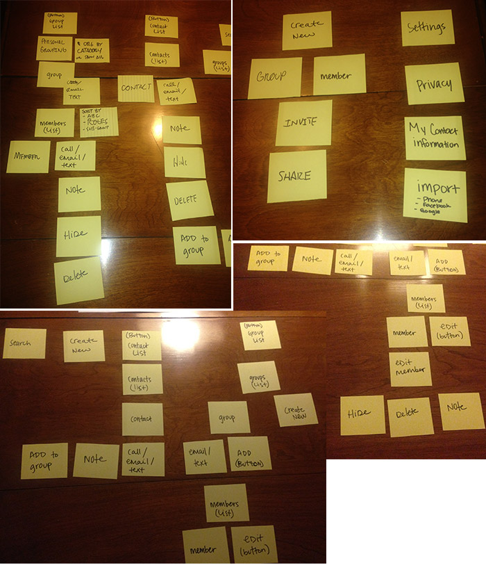
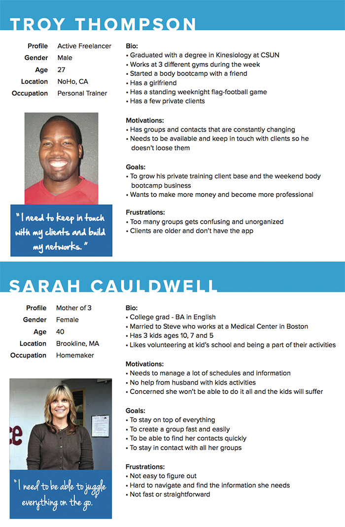
I went through the entire UX process for this project, starting with user interviews. I interviewed 3 people—2 working moms, and one freelance professional—about how they would potentially use Contact Wrangler. I conducted 2 different card sorting exercises with 3 other potential users. Once I gathered that data, I had a foundation for my personas. I created 2—Troy is a freelance Personal Trainer, and Sarah is a homemaker and mother of 3. Both have to manage many different groups of people throughout their day.
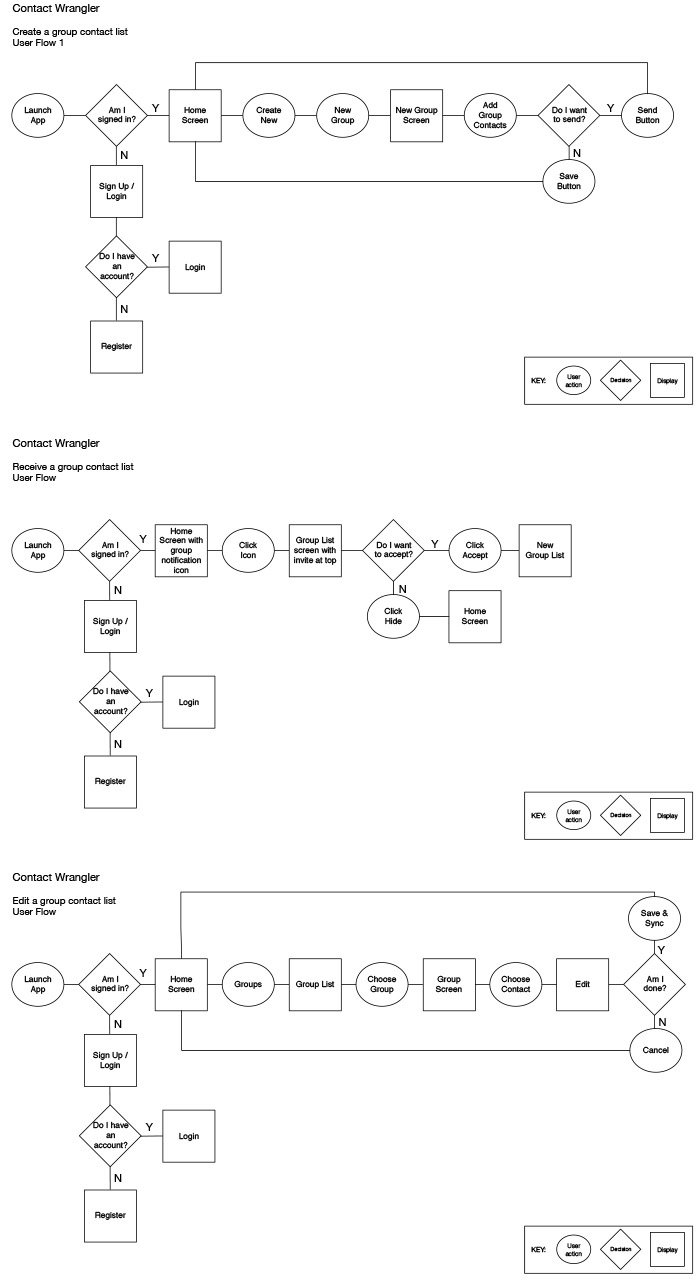
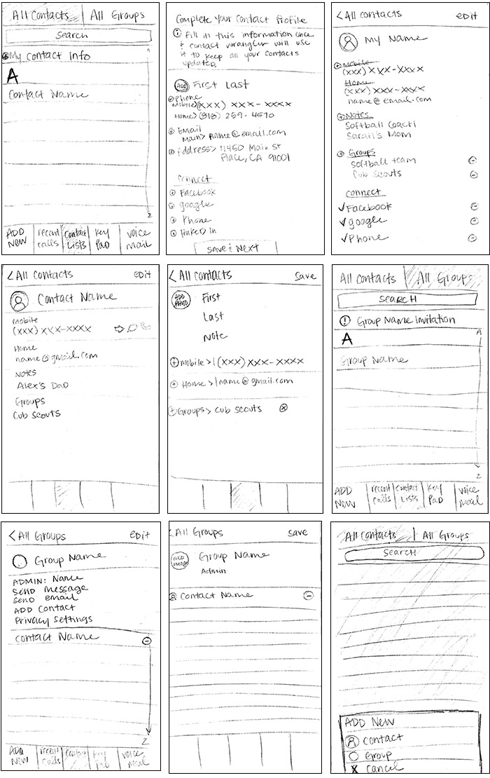
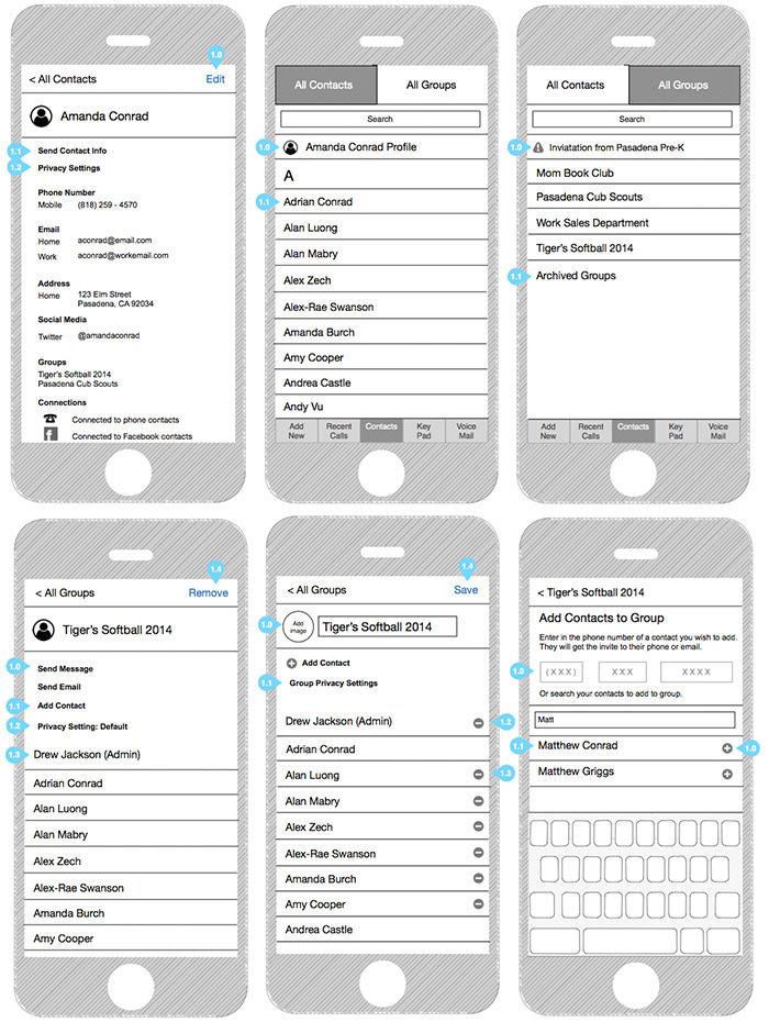
For the design, I started with a simple site map and 4 different user flows. I based each user flow on solving a specific task: 1. Create a group contact list, 2. Edit a group contact list, 3. Receive a contact list, 4. Create a contact. With that information in hand I was able to create simple wireframes of the application.
My next step is to create some branding for this app, and to work on the interface and visual design.

